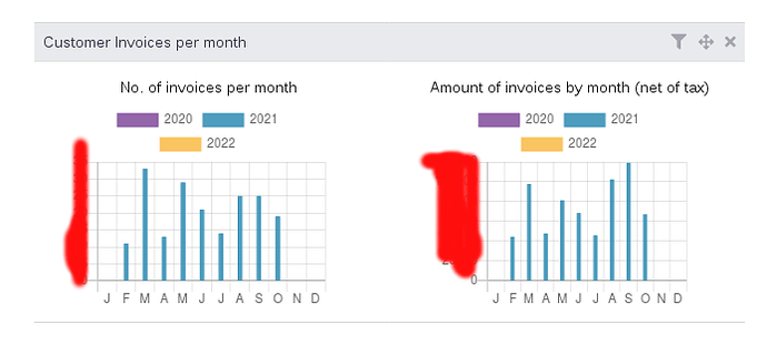
In 12.x there were only two graphs (purple and blue) in the widget which was okay, but after upgrading to 14.x another color - yellow - was added. This color is very hard to see for any of us. Is there any way to change the graph colors?
After poking around in the source code it seems that the graph colors are hard coded. That sucks.
1 Like


