Hello community,
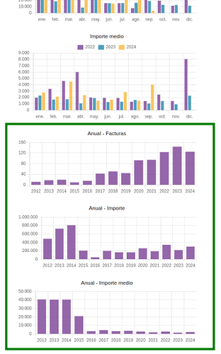
This week I set out to implement some bar graphs summarizing annual invoicing for my own use. I’ve been using Dolibarr since 2017, and when I first started, I took the opportunity to input invoices from the previous 5 years, allowing me to now have an interesting history to analyze.
As a result, it took little effort to turn this improvement into a small module that I’ve published on Dolistore for one euro:
https://www.dolistore.com/en/modules/2215-Yearly-Invoices-Statistics.html
If you install it, you’ll see that when you go to the “Billing” section (or similar, depending on the language you use) of the main menu, in the “Statistics” sub-section for Customers or Suppliers, three new bar graphs appear below the native Dolibarr graphs showing the evolution over the last 36 months.
Following the same logic as those graphs, I’m displaying these three metrics:
- Number of invoices per year
- Sum of invoices per year
- Average amount of invoices per year
To-Do
I still have a few things to add, such as including two series per graph instead of just one:
- Paid invoices
- Unpaid invoices
This might be of interest to some of you. For me, it’s not really necessary, but I understand it could be useful for other types of businesses.
Constructive suggestions for improvement are welcome ![]()


