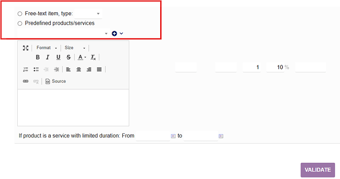
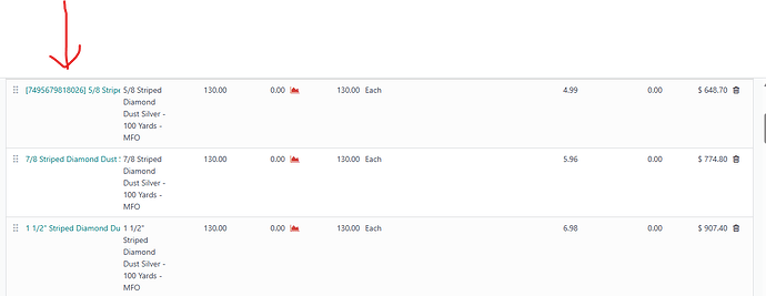
The Dolibarr Sales Order screen is weird. This predefined and drop-down menu is not user friendly.
Is there a way to make the Sales Order screen look more like a Sales Order and just type the product name and tab across? More like QuickBooks or Odoo?


