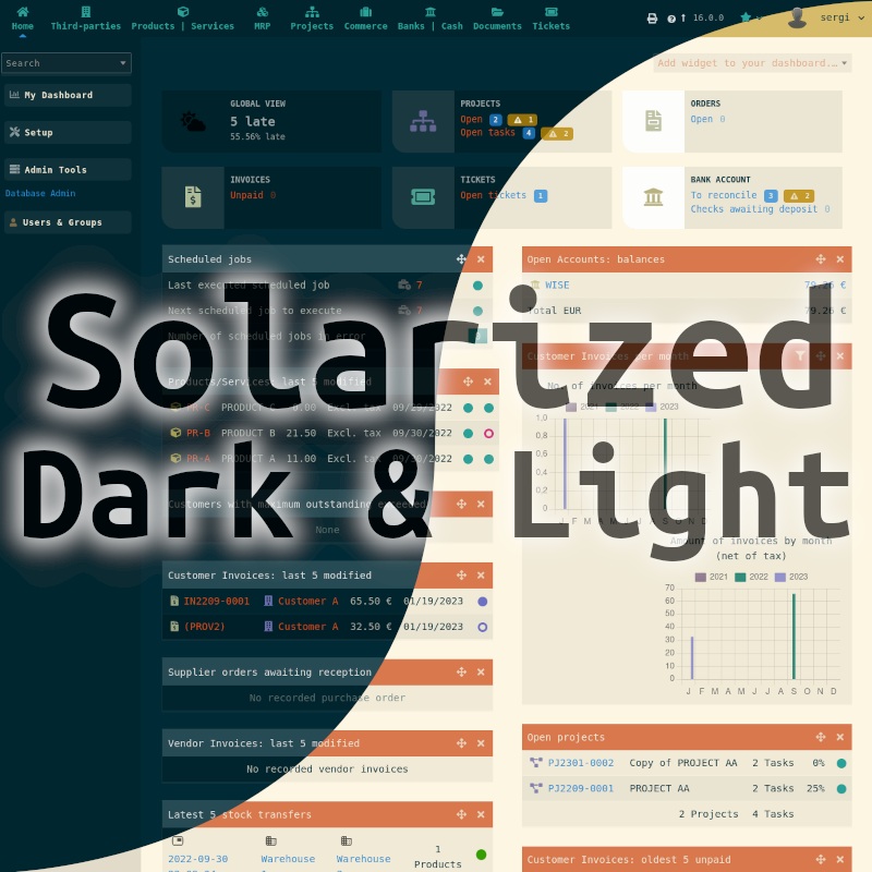
It’s been a few years since I created a SOLARIZED THEME for Dolibarr 16, and I’ve been keeping it up to date. Today, I just released the update compatible with the brand new version of Dolibarr 21.0.0.
I don’t want to be misunderstood: Dolibarr’s native modules are excellent and improve with each version. They look minimalist and fresh. But some of us sometimes prefer something with more color for our daily software interfaces.
In fact, I created it initially due to my precarious vision situation before my cataract problems and needing to create my other DarkTheme (in Dolistore, but no longer updated). Once I underwent cataract surgery and regained my sight, I had already developed a taste for dark interfaces. Of course, I no longer needed “so much darkness,” and that’s when I discovered the Solarized color palette, which is used in many other software applications. I wanted to make my version for Dolibarr.
Who and Why Created the Popular Solarized Palette
If you haven’t heard of the Solarized color palette, I’ll give you a brief summary:
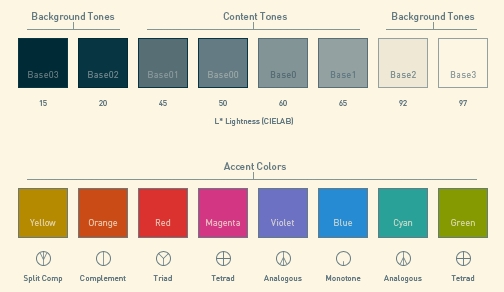
It was designed by Ethan Schoonover, launched in April 2011, to enhance readability and reduce visual fatigue in programming and text editing environments.
Schoonover began working on Solarized when he couldn’t find a color scheme he liked for his code editor. He wanted something smoother than traditional black-on-white schemes but maintained good contrast for highlighted syntax.
Schoonover spent six months researching and designing Solarized using the CIELAB color space to ensure visual consistency across different lighting conditions and screens.
Technical and Usability Features
Color Palette: Solarized consists of 16 colors, divided into eight monochromatic tones and eight accent colors. It’s available in light and dark modes, designed to be opposites yet consistent with each other.
Compatibility: The palette has been implemented in a wide variety of applications, including code editors like Vim, Emacs, and terminals like iTerm2.
Readability: Solarized focuses on maintaining adequate visual contrast without being too intense, which helps reduce visual fatigue during extended work periods.
On the official website you can find themes for other software using this palette.
Search Dolistore for “Solarized” if you want to see more screenshots of this theme.
I will use this thread to add information about future updates.
Hello, my theme ONLY changes COLORS so it cannot solve any “layout issue”.
Properly talking, using CSS could be possible to “slightly” modify layout structure. For example:
with CSS you can detect the screen width size to detect mobile devices
width CSS you can give “block” or “flex” or “grid” properties to tables
so, technically i could try to solve some kind of issues in “mobile layout”. But certainly, this is not cheap in hours to get this work fine. It’s completely out of the scope of my theme.
Furthermore, i cannot imagine someone managing a complex and complete ERP in a mobile device Although i know that some customers of mine sometimes need to consult it being in the street. So my recommendation for them is to use a tablet in these cases
I use Dolibarr as the main backend tool in a non profit dance organisation - more below on what I put in front and after.
The issues I have the most with mobile dolibarr is expense reports. Because as a non profit we rely on volunteers to help out with dance events, and some times they have to buy stuff for us, or they have to buy dinner if they have an evening of volunteer work.
So they screenshot the receipt with their phone and then they want to fill in the Expense Report from their phone so they can get their refund.
I could also see the use case where you delivered something for a customer, some kind of service, or repair and you wanted to record the data as soon as possible, possibly sitting in their car.
I suspect that Dolidroid only offers custom menus, similar to those found in a mobile app, while the other Dolibarr elements are loaded within a webview component of the app.
The webview component functions like a “web browser within the app.” In these cases, the experience is similar to loading Dolibarr in a regular web browser. In the best-case scenario, you get more optimized menus and bars compared to those typically found in a web browser.
@jonbendtsen DoliDroid loads the main content in the same way that a web browser does. In the official announcement from 2021, when the project was released as open source, additional technical information was provided:
I see a promising opportunity here to implement a “simple” transformation technique to convert table lists (such as customers, invoices, expenses, etc.) into a “grid” or “flex” layout using CSS. This might be feasible.
I will look for time to conduct my own tests. However, I suspect that the fact that this has not yet been done means it may not be as “easy” or “viable” as it seems.